The Carpet Stays: Building a Wall Palette Around Floors You Already Own
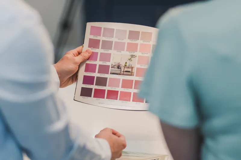
Most decorating projects begin in the same place: someone opens a fan deck, falls for a soft green or a chalky pink, and then looks down at the carpet with a faint sense of dread. The walls can be repainted. The carpet, more often than not, is staying put. So instead of choosing a wall colour in isolation and hoping the floor behaves, it makes far more sense to start with the carpet and work upwards.
That does not mean every room has to be beige because the carpet is beige. It means the floor is part of the scheme, not an inconvenient obstacle. Get the undertone and temperature right and a fixed carpet can start to look intentional. Get them wrong and even a beautiful paint colour can feel slightly off every time you walk in.
Read the carpet before you reach for the fan deck
Carpets are rarely just ‘grey’ or ‘beige’. They have undertones, and those undertones change how wall colours read. A warm beige carpet with yellow or pink hints can make a cool grey wall look icy and slightly clinical. A cool grey carpet with blue undertones can make a creamy off-white look dingy, even when it looked fresh in the shop.
The simplest test is to take a piece of plain white paper and hold it against the carpet near a window. Does the carpet look warmer, cooler, pinker or greener next to the white? Then do the same with a pure grey sample if you have one. You are not trying to name the colour precisely; you are trying to spot which direction it leans.
Patterned carpets are a little different. Rather than searching for one dominant colour, look for the quieter secondary colours. Those are usually the ones that work best on the walls, because they support the pattern without competing with it.
Daylight, lamplight and the British five o’clock problem
Once you have a shortlist of wall colours, paint large sample patches directly onto the wall, not onto lining paper propped nearby. Put them where they meet the carpet and skirting board, because that junction is where clashes show up first. Look at them in the morning, in the middling grey light of a British afternoon, and again in the evening with the lamps you actually use.
This matters more in the UK than many colour charts admit. North-facing rooms can make warm carpets look flatter and cool paint look almost blue. A lamp with a warm bulb can pull a greige wall towards brown. If a colour only works at midday in July, it is not the right colour for a room you use in November.
Beige carpets: work with the warmth
Beige is not a neutral blank canvas. It is a family of colours, and the most common mistake is trying to cool it down too aggressively. If the carpet has a warm, creamy or sandy feel, look at wall colours with a little warmth of their own: soft sage, clay, mushroom, oatmeal, muted terracotta or a gentle off-white with a hint of stone. These colours make the carpet feel softer and more deliberate rather than apologetic.
If the beige is cooler and greyer, more of a greige, you have more room to move. Muted blue-grey, soft pewter, pale olive or a clean off-white can work well. What usually fails is the exact-match approach. Trying to find a wall colour identical to a large beige carpet can make the room feel flat and slightly institutional. A little contrast, or a shade from the same family, gives the eye something to do.
Grey carpets: stop fighting the temperature
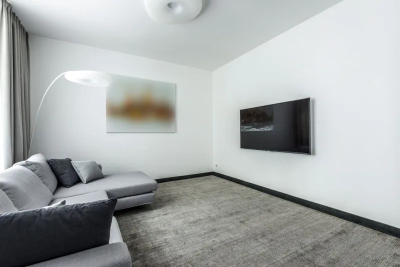
Grey carpets are common in modern UK homes, but they are not all the same. A cool blue-grey carpet often sits happily with walls in soft blue-green, navy, crisp white or a slightly cooler off-white. It can look sharp and calm, especially in rooms with plenty of daylight.
A warm grey carpet, sometimes closer to taupe, tends to prefer wall colours with a bit of earthiness: olive, blush, soft black, warm white or a muted stone. Pairing a warm grey carpet with an icy blue wall can leave both looking slightly wrong, as if they are in different rooms.
If the carpet is mid-grey and you want a cosy result, do not assume you need more grey. A warmer wall colour can stop the room feeling like a show home. If you want a more dramatic look, a deeper wall colour can work beautifully, but test it against the carpet at the skirting board. Dark walls and grey carpets can either look sophisticated or strangely heavy, and the difference is usually in the undertone.
Patterned carpets: let the walls be the supporting act
A patterned carpet already does a lot of talking. The wall colour should not try to out-shout it. Pick one of the quieter colours from the pattern and use a softer version on the walls. If the carpet has a busy floral or geometric design, a plain wall in a related tone will make the pattern feel chosen rather than chaotic.
You can also go tonal: choose a wall colour that sits close to the carpet’s background shade but a little lighter or darker. This creates a calm, layered room without asking the walls to match the floor exactly. Avoid pulling out every colour in the pattern at once. One supporting colour and one accent is usually plenty.
When a rug is the smarter fix
Sometimes the carpet is not just fixed; it is tired, dominant or simply not to your taste. In that case, a large rug can change how the floor reads without the cost and disruption of replacing it. A rug in a different texture or colour can create a visual boundary around a seating area, making the carpet feel more like a background than the main event.
This is not a magic trick for covering a whole room, and it is not a substitute for replacing worn carpet. But a well-chosen rug can buy you time and make a wall colour work when the carpet alone would fight it. Just make sure it sits safely, with an underlay or anti-slip layer, especially on stairs and in busy walkways.
Build the scheme from the floor up
Once the wall colour is chosen, check the skirting boards, ceiling and any fixed furniture against it. In many UK homes, the carpet, skirting and door frames are all part of the same visual package. A wall colour that looks lovely next to the carpet can still fall apart if the skirting is a stark brilliant white or the ceiling has yellowed.
Start at floor level, test in real light, and choose a wall colour that makes the carpet look like it belongs. That is a far more reliable route to a room that feels finished than picking a paint colour first and hoping the floor keeps up.