Period Homes, Modern Living: Colour and Finish Choices for Victorian, Edwardian and 1930s Rooms
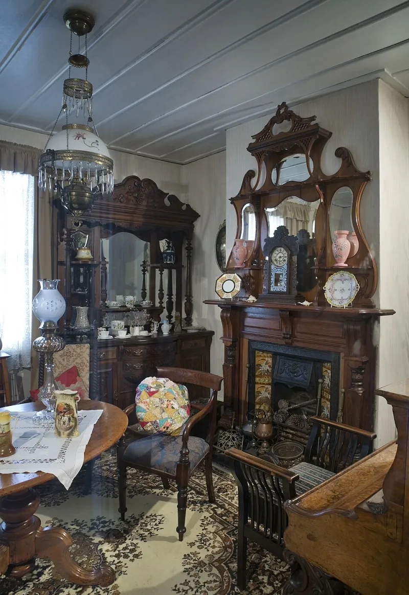
Photo: Jorge Royan, CC BY-SA 3.0, via Wikimedia Commons
Period homes come with a personality already built in. The ceiling height, the mouldings, the proportions of a window and the way light lands on a wall are all part of the architecture. Decorating a Victorian, Edwardian or 1930s house well isn't about recreating a heritage catalogue. It's about choosing colours and finishes that let the building's character do its thing while still working for how you live in 2026.
Start with the bones, not the colour card
Before you fall for a paint chart, look at the room properly. How high is the ceiling? How much natural light comes in, and when? Are there original cornices, picture rails, skirting boards or fireplaces? Is the room used for breakfast, work, TV, sleep or all four?
Ceiling height changes everything. A dark colour in a room with a low ceiling can feel cosy or cave-like, depending on the light. In a tall Victorian room, a deeper shade can bring the walls in and make the space feel deliberate rather than stretched. Mouldings and original features also deserve a plan. Painting everything the same colour can look sharp and modern, but it can also flatten detail that gives the house its character.
Victorian homes: embrace the depth, within reason
Victorian rooms often have high ceilings, generous proportions and plenty of original detail. They can carry stronger colours than newer homes, but that doesn't mean every room needs a dramatic jewel tone. Deep greens, muted burgundies, earthy ochres and rich blues work well when the light is good and the room has enough period detail to balance them.
A practical approach is to keep ceilings and cornices a soft off-white or pale stone, then use colour below the picture rail. Matt emulsion on walls gives a smooth, chalky look that suits older plaster. For woodwork, eggshell in a related shade or a clean off-white is more forgiving than high gloss and still looks smart. In hallways and dining rooms, deeper shades can work beautifully, but test them on a large patch first. Victorian rooms can be surprisingly dark in the middle of the day.
Edwardian homes: lighter, airier, softer
Edwardian houses often feel a little lighter and less heavy-handed than Victorian ones. Windows tend to be larger, rooms can be broader, and the detailing is often simpler. That gives you room to use softer colours: pale sage, stone, dusty blue, warm off-white and gentle greens.
Don't assume pale means boring. In an Edwardian room, a soft green or chalky blue can let the mouldings and proportions do the talking. Satinwood or eggshell on woodwork is a good middle ground between flat matt and full gloss. If you want a bit of depth, use a stronger colour on the inside of a chimney breast or below a dado rail rather than committing the whole room to a dark shade.
1930s homes: geometry, warmth and practical finishes
1930s homes often have lower ceilings and more geometric details than earlier periods. You might see square bay windows, Crittall-style metal windows or simpler skirting and door profiles. The trick here is to avoid making low rooms feel lower. Keep ceilings light, use warmer neutrals and soft colours that reflect what light you have, and be careful with strong colours on every wall.
Duck egg, soft yellow, warm grey and muted green all sit comfortably in a 1930s setting. Satin or eggshell finishes on woodwork work well, especially in hallways where durability matters. If the house has original features such as a picture rail or tiled fireplace, don't bury them under a single block of colour. Let them read as part of the room.
Mouldings, radiators and the details people notice
Period features can be a blessing or a headache. Original cornices and deep skirting boards add character, but if they're thick with old paint, the detail can disappear. Repairing and repainting mouldings properly is often worth more than changing the wall colour.
Radiators are another detail. Painting them to match the wall can help them fade away, while a contrasting shade turns them into a feature. Either can work. Just decide deliberately rather than leaving a rusty old radiator to fight with a carefully chosen palette.
Match the finish to the room's job
A hallway takes more punishment than a spare bedroom. A family dining room needs a washable finish. A bedroom can carry a softer, more cocooning colour. In period homes, it's easy to get carried away with the look and forget the practical side. Durable matt or eggshell in high-traffic areas, and a gentler finish in rooms that see less action, is a sensible balance.
Old house, modern life
A period home doesn't need to look like a film set. Good modern lighting, comfortable furniture and a few well-chosen colours can sit happily alongside original features. The key is to respect the architecture without being ruled by it. Try sample pots on different walls, look at them at morning and evening, and see how the colour behaves next to the floor and any original woodwork.
The best period decorating isn't about recreating the past. It's about choosing colours and finishes that make the house feel like it belongs to you in 2026, while still letting the building's age and character show through.